This is a guest post by the React Native Paper team. If you like this guide, check out React Native Paper for more!
In this blog post, we'll show you how to build a Twitter clone app using React Navigation v5 and Paper.
Introduction
The React Navigation v5 comes with many great improvements compared to previous version. It not only provides a cross-platform native Stack, but also the API was redesigned from the ground up to allow things that were never possible before. Thanks to the component-based API, all of the configuration is happening inside the render method. This means we can access props, state and context and can dynamically change configuration for the navigator.
What is React Native Paper?
React Native Paper is a UI component library that implements MD Guidelines. It allows building beautiful interfaces on Mobile and Web with high-quality cross-platform components. Furthermore, Paper provides you with a full theming support, accessibility, RTL and it will take care of platform adaptation. This means you can focus on building apps with ready to use components instead of reimplementing the boring stuff.
In this guide, we would like to show you how to integrate React Navigation with Paper's components. To show all the details of the integration we've decided to build a clone of Twitter. Of course, the functionalities will be very limited but the navigation part and main screens should look and feel similar.
In the following gif, you can see what is the final version of the app gonna looks like:
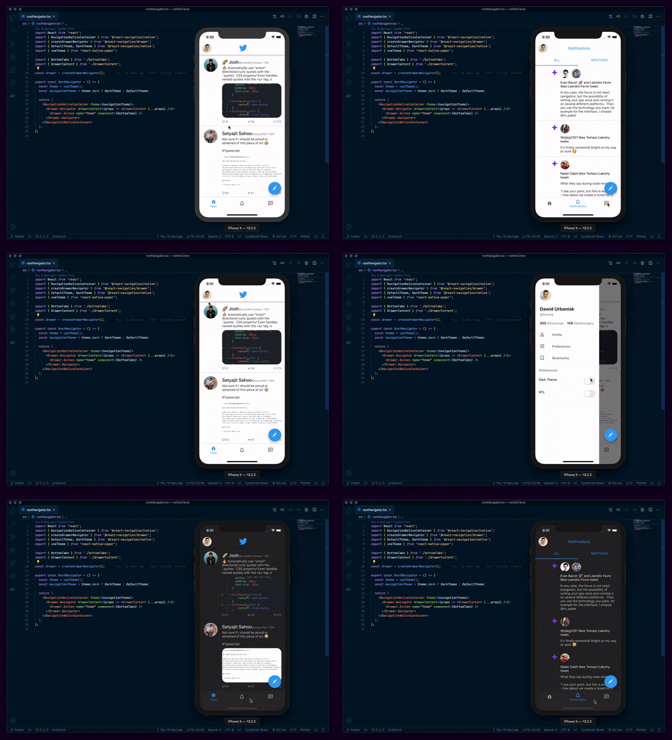
Overview of the App
Since original Twitter is a very complex app, we will build only a part of it. This means we will implement:
- Drawer
- Stack Navigator with two screens: Screen showing bottom navigation and Details of a tweet
- Bottom navigation with 3 tabs: Feed, Notifications, and Messages
I will focus this guide on a React Navigation and React Native Paper integration. It means I won't show you how to build all of the components necessary to create such an app, but you can always check the full implementation in the github repo.
Let's get started!
Getting started
I assume you already have an Expo project running locally. If not, make sure to create one. I chose Expo over plain React-Native because it includes most of the dependencies that we need so there is less work to do for us.
Let's install React Native Paper, React Navigation v5 and other required dependencies.
npm install @react-navigation/native @react-navigation/stack @react-native-community/masked-view @react-navigation/drawer @react-navigation/material-bottom-tabs react-native-paper
In the next step we will make sure versions of these libraries are compatible.
expo install react-native-gesture-handler react-native-reanimated react-native-screens react-native-safe-area-context
After you run these two commands you should be ready to go. Let's start implementing the app!
React Navigation and React Native Paper initial setup
Both these libraries require minimal setup.
In case of React Native Paper, we need to wrap the component tree with a Provider. You can do this inside the exported component in the App.js file.
import React from 'react';
import { Provider as PaperProvider } from 'react-native-paper';
import Main from './src/Main';

export default function App() {
  return (
    <PaperProvider>
      <Main />
    </PaperProvider>
  );
}
The PaperProvider provides the theme to all the components in the framework. It also acts as a portal to components that need to be rendered at the top level. Check the full Getting-Started page for more information.
React Navigation setup looks similar. There is a component called NavigationContainer which manages our navigation tree and contains the navigation state. It must wrap all navigator structure. We will render this component in App.tsx inside a PaperProvider. More information can be found in the official documentation.
import React from 'react';
import { Provider as PaperProvider } from 'react-native-paper';
import { NavigationContainer } from '@react-navigation/native';
import Main from './src/Main';

export default function App() {
  return (
    <PaperProvider>
      <NavigationContainer>
        <Main />
      </NavigationContainer>
    </PaperProvider>
  );
}
Drawer
In our Twitter clone, we want to implement a Drawer that is available from any screen in the app. This means it has to be a topmost navigator.
In React Navigation v5 there is a common pattern for creating navigators. After importing createXNavigator function from the navigator package of your choice you can use Navigator and Screen components from the value it returns.
So let's create a basic version of a Drawer:
import React from 'react';
import { Text, View } from 'react-native';
import { createDrawerNavigator } from '@react-navigation/drawer';

const Drawer = createDrawerNavigator();

function DrawerContent() {
  return (
    <View style={{ flex: 1, alignItems: 'center', justifyContent: 'center' }}>
      <Text>Drawer content</Text>
    </View>
  );
}

function HomeScreen() {
  return (
    <View style={{ flex: 1, alignItems: 'center', justifyContent: 'center' }}>
      <Text>Home Screen</Text>
    </View>
  );
}

export const RootNavigator = () => {
  return (
    <Drawer.Navigator drawerContent={() => <DrawerContent />}>
      <Drawer.Screen name="Home" component={HomeScreen} />
    </Drawer.Navigator>
  );
};
That's what we see on a screen:

We can open a drawer with a swipe gesture, it looks very smooth. However, the UI doesn't look very impressive so let's add more content to the drawer to make it look just like in the final version.
We will use:
- DrawerContentScrollView and DrawerItem from @react-navigation/drawer
- Avatar, Text and Switch from react-native-paper
DrawerContentScrollView component makes the drawer vertically scrollable and provides support for devices with notches, so it's highly recommended to use it even for custom drawers.
Components from React Native Paper make a clean, material UI.
import React from 'react';
import { View, StyleSheet } from 'react-native';
import {
  DrawerItem,
  DrawerContentScrollView,
} from '@react-navigation/drawer';
import {
  useTheme,
  Avatar,
  Title,
  Caption,
  Paragraph,
  Drawer,
  Text,
  TouchableRipple,
  Switch,
} from 'react-native-paper';
import { MaterialCommunityIcons } from '@expo/vector-icons';

export function DrawerContent(props) {
  return (
    <DrawerContentScrollView {...props}>
      <View
        style={
          styles.drawerContent,
        }
      >
        <View style={styles.userInfoSection}>
          <Avatar.Image
            source={{
              uri:
                'https://pbs.twimg.com/profile_images/952545910990495744/b59hSXUd_400x400.jpg',
            }}
            size={50}
          />
          <Title style={styles.title}>Dawid Urbaniak</Title>
          <Caption style={styles.caption}>@trensik</Caption>
          <View style={styles.row}>
            <View style={styles.section}>
              <Paragraph style={[styles.paragraph, styles.caption]}>
                202
              </Paragraph>
              <Caption style={styles.caption}>Following</Caption>
            </View>
            <View style={styles.section}>
              <Paragraph style={[styles.paragraph, styles.caption]}>
                159
              </Paragraph>
              <Caption style={styles.caption}>Followers</Caption>
            </View>
          </View>
        </View>
        <Drawer.Section style={styles.drawerSection}>
          <DrawerItem
            icon={({ color, size }) => (
              <MaterialCommunityIcons
                name="account-outline"
                color={color}
                size={size}
              />
            )}
            label="Profile"
            onPress={() => {}}
          />
          <DrawerItem
            icon={({ color, size }) => (
              <MaterialCommunityIcons name="tune" color={color} size={size} />
            )}
            label="Preferences"
            onPress={() => {}}
          />
          <DrawerItem
            icon={({ color, size }) => (
              <MaterialCommunityIcons
                name="bookmark-outline"
                color={color}
                size={size}
              />
            )}
            label="Bookmarks"
            onPress={() => {}}
          />
        </Drawer.Section>
        <Drawer.Section title="Preferences">
          <TouchableRipple onPress={() => {}}>
            <View style={styles.preference}>
              <Text>Dark Theme</Text>
              <View pointerEvents="none">
                <Switch value={false} />
              </View>
            </View>
          </TouchableRipple>
          <TouchableRipple onPress={() => {}}>
            <View style={styles.preference}>
              <Text>RTL</Text>
              <View pointerEvents="none">
                <Switch value={false} />
              </View>
            </View>
          </TouchableRipple>
        </Drawer.Section>
      </View>
    </DrawerContentScrollView>
  );
}

const styles = StyleSheet.create({
  drawerContent: {
    flex: 1,
  },
  userInfoSection: {
    paddingLeft: 20,
  },
  title: {
    marginTop: 20,
    fontWeight: 'bold',
  },
  caption: {
    fontSize: 14,
    lineHeight: 14,
  },
  row: {
    marginTop: 20,
    flexDirection: 'row',
    alignItems: 'center',
  },
  section: {
    flexDirection: 'row',
    alignItems: 'center',
    marginRight: 15,
  },
  paragraph: {
    fontWeight: 'bold',
    marginRight: 3,
  },
  drawerSection: {
    marginTop: 15,
  },
  preference: {
    flexDirection: 'row',
    justifyContent: 'space-between',
    paddingVertical: 12,
    paddingHorizontal: 16,
  },
});
The final version of a drawer looks like this:

Stack Navigator + Paper's Appbar
Stack Navigator provides a way for an app to transition between screens when each new screen is placed on top of a stack. In case of this Twitter clone, we will use it to transition from a screen displaying a feed of tweets to the screen showing details of a tweet.
React Navigation v5 provides two implementations of a Stack Navigator
- Native Stack
- JS-based Stack
The main difference between them is that JS-based stack re-implements animations and gestures while the native stack navigator relies on the platform primitives for animations and gestures.
In this section, we will integrate React Native Paper Appbar and JS-based Stack Navigator.
As a first step, we will create a minimal version of a Stack:
import React from 'react';
import { createStackNavigator } from '@react-navigation/stack';

import { Feed } from './feed';
import { Details } from './details';

export const FeedStack = () => {
  return (
    <Stack.Navigator initialRouteName="Feed">
      <Stack.Screen
        name="Feed"
        component={Feed}
        options={{ headerTitle: 'Twitter' }}
      />
      <Stack.Screen
        name="Details"
        component={Details}
        options={{ headerTitle: 'Tweet' }}
      />
    </Stack.Navigator>
  );
};
By default, the stack navigator is configured to have the familiar iOS and Android header. That doesn't suit our needs, because we want to use Paper's Appbar instead.
We can achieve that by passing an Appbar.Header component as a header in Stack's screenOptions. We will also pass a headerMode prop with a value of screen to have a nice looking fade in/out animation.
import React from 'react';
import { TouchableOpacity } from 'react-native';
import { createStackNavigator } from '@react-navigation/stack';
import { Appbar, Avatar } from 'react-native-paper';
import { MaterialCommunityIcons } from '@expo/vector-icons';

import { Feed } from './feed';
import { Details } from './details';

const Header = ({ scene, previous, navigation }) => {
  const { options } = scene.descriptor;
  const title =
    options.headerTitle !== undefined
      ? options.headerTitle
      : options.title !== undefined
      ? options.title
      : scene.route.name;

  return (
    <Appbar.Header theme={{ colors: { primary: theme.colors.surface } }}>
      {previous ? (
        <Appbar.BackAction
          onPress={navigation.pop}
          color={theme.colors.primary}
        />
      ) : (
        <TouchableOpacity
          onPress={() => {
            navigation.openDrawer();
          }}
        >
          <Avatar.Image
            size={40}
            source={{
              uri:
                'https://pbs.twimg.com/profile_images/952545910990495744/b59hSXUd_400x400.jpg',
            }}
          />
        </TouchableOpacity>
      )}
      <Appbar.Content
        title={
          previous ? title : <MaterialCommunityIcons name="twitter" size={40} />
        }
      />
    </Appbar.Header>
  );
};

export const FeedStack = () => {
  return (
    <Stack.Navigator
      initialRouteName="FeedList"
      headerMode="screen"
      screenOptions={{
        header: ({ scene, previous, navigation }) => (
          <Header scene={scene} previous={previous} navigation={navigation} />
        ),
      }}
    >
      <Stack.Screen
        name="Feed"
        component={Feed}
        options={{ headerTitle: 'Twitter' }}
      />
      <Stack.Screen
        name="Details"
        component={Details}
        options={{ headerTitle: 'Tweet' }}
      />
    </Stack.Navigator>
  );
};
The Function that we pass to header prop has access to 3 properties:
- scene
- previous
- navigation
Thanks to the scene property we can access the title of topmost screen on the stack and display it in the header. Previous property tells us if there are any other screens lower on the Stack.
Finally, **navigation** property allows navigating to different screens e.g. opening a Drawer.
The thing that we haven't covered yet and it is very important is how to actually navigate between Stack Navigator screens. In case of Tab or Drawer Navigator, we get it out of the box. We can swipe to open/close the Drawer or press a tab to change the scene. In Stack, we have to implement it by ourselves.
React Navigation gives us many different ways to navigate, but we will mostly focus on push and pop. You can access these two methods in navigation prop.
As the name suggests push method pushes the new screen on the stack and pop removes current screen from the stack.
As you can see on a snippet above, we invoke a navigation.pop function whenever user presses the back button in header. This means user will be allowed to come back from Details to the Feed screen.
We still need to implement an option to go from Feed to the Details. We can do it by invoking navigation.push('Details') whenever user presses a Tweet.
function onTweetPress() {
  navigation.push('Details');
}
The implementation of Feed and Details components is quite big and complex, that's why I am not gonna post it here. Please make sure to check it out on github repo
We have covered only the basics of navigating between screens. If you want to learn more details check the official documentation.
Now, let's see what does the app looks like with Stack Navigator and Paper's Appbar.
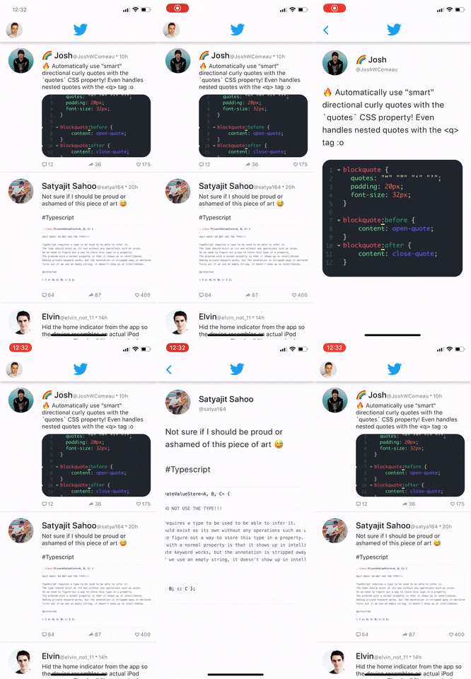
We still miss the last piece of our navigation flow - Tab Navigator. Let's move to the next section where we will take care of it.
Bottom Navigation
In this section, we will implement a Tab Navigator with 3 tabs and we will make sure this component is now a one of Stack's screen.
We will use a Bottom Navigation component from React Native Paper that is exposed via @react-navigation/material-bottom-tabs package.
Let's import the createMaterialBottomTabNavigator function first.
import { createMaterialBottomTabNavigator } from '@react-navigation/material-bottom-tabs';
Then we can get a reference to the Tab.Navigator and Tab.Screen components.
const Tab = createMaterialBottomTabNavigator();
Now, we are ready to build the actual Bottom Navigation. We will render a Tab.navigator and 3 Tab.Screen components as children. Each Tab.Screen representing a tab.
import React from 'react';
import { createMaterialBottomTabNavigator } from '@react-navigation/material-bottom-tabs';

import { Feed } from './feed';
import { Messages } from './messages';
import { Notifications } from './notifications';

const Tab = createMaterialBottomTabNavigator();

export const BottomTabs = () => {
  return (
    <Tab.Navigator
      initialRouteName="Feed"
      shifting={true}
      sceneAnimationEnabled={false}
    >
      <Tab.Screen
        name="Feed"
        component={Feed}
        options={{
          tabBarIcon: 'home-account',
        }}
      />
      <Tab.Screen
        name="Notifications"
        component={Notifications}
        options={{
          tabBarIcon: 'bell-outline',
        }}
      />
      <Tab.Screen
        name="Messages"
        component={Messages}
        options={{
          tabBarIcon: 'message-text-outline',
        }}
      />
    </Tab.Navigator>
  );
};
When we check the screen of the phone now, we will see a nice looking, material bottom navigation. What's more, Stack Navigator integrates nicely with Tab.Navigator and we can still navigate to the tweet Details screen.
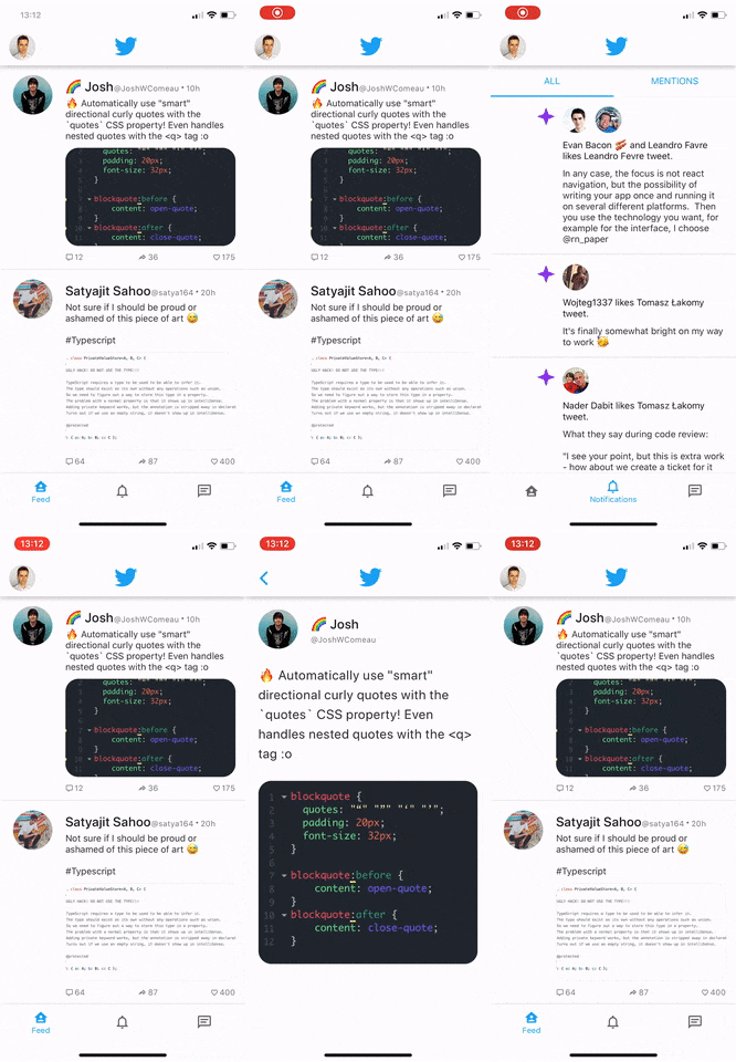
FAB and Portal
As it is stated in Material Design Guidelines, the purpose of the FAB button is to give easy access to the main action of the application. Of course, the official Twitter app follows this pattern. Based on the type of screen, it allows creating new tweets or sending direct messages via FAB. It also smoothly animates the icon of the FAB when the user changes the tab and hides the FAB completely on specific screens.
In this section, we are going to implement the very same behaviour in our app. We are going to use a FAB and Portal components from React Native Paper.
Portal allows rendering a component at a different place in the parent tree. It means you can use it to render content that should appear above other elements, similar to Modal.
As an initial step, we will render a FAB on all tabs and then we will add additional functionalities.
Let's render a FAB and Portal in the same component where we render Tabs:
import React from 'react';
import { createMaterialBottomTabNavigator } from '@react-navigation/material-bottom-tabs';
import { useTheme, Portal, FAB } from 'react-native-paper';

import { Feed } from './feed';
import { Message } from './message';
import { Notifications } from './notifications';

const Tab = createMaterialBottomTabNavigator();

export const BottomTabs = () => {
  return (
    <React.Fragment>
      <Tab.Navigator
        initialRouteName="Feed"
        backBehavior="initialRoute"
        shifting={true}
        sceneAnimationEnabled={false}
      >
        <Tab.Screen
          name="Feed"
          component={Feed}
          options={{
            tabBarIcon: 'home-account',
          }}
        />
        <Tab.Screen
          name="Notifications"
          component={Notifications}
          options={{
            tabBarIcon: 'bell-outline',
          }}
        />
        <Tab.Screen
          name="Messages"
          component={Message}
          options={{
            tabBarIcon: 'message-text-outline',
          }}
        />
      </Tab.Navigator>
      <Portal>
        <FAB
          icon="feather"
          style={{
            position: 'absolute',
            bottom: 100,
            right: 16,
          }}
        />
      </Portal>
    </React.Fragment>
  );
};
With just a few lines of JSX we have a nice looking FAB displayed on all tabs. Let's implement hiding it whenever the user goes to the tweet details screen.
Our current navigation structure should be:
- StackNavigator that has two screens
- The First screen of StackNavigator renders a TabNavigator with 3 tabs
- The Second screen of StckNavigator renders a Tweet details
This means a component that renders TabNavigator is a Stack's screen. Thanks to that, we can use useIsFocused hook provided by @react-navigation/native and conditionally hide FAB.
import React from 'react';
import { createMaterialBottomTabNavigator } from '@react-navigation/material-bottom-tabs';
import { useTheme, Portal, FAB } from 'react-native-paper';
import { useIsFocused } from '@react-navigation/native';

import { Feed } from './feed';
import { Message } from './message';
import { Notifications } from './notifications';

const Tab = createMaterialBottomTabNavigator();

export const BottomTabs = () => {
  const isFocused = useIsFocused();

  return (
    <React.Fragment>
      <Tab.Navigator
        initialRouteName="Feed"
        backBehavior="initialRoute"
        shifting={true}
      >
        <Tab.Screen
          name="Feed"
          component={Feed}
          options={{
            tabBarIcon: 'home-account',
          }}
        />
        <Tab.Screen
          name="Notifications"
          component={Notifications}
          options={{
            tabBarIcon: 'bell-outline',
          }}
        />
        <Tab.Screen
          name="Messages"
          component={Message}
          options={{
            tabBarIcon: 'message-text-outline',
          }}
        />
      </Tab.Navigator>
      <Portal>
        <FAB
          visible={isFocused} // show FAB only when this screen is focused
          icon="feather"
          style={{
            position: 'absolute',
            bottom: safeArea.bottom + 65,
            right: 16,
          }}
        />
      </Portal>
    </React.Fragment>
  );
};
In the last step we will add ability to show different icon depending on the active tab.
We will take an advantage of our BottomTabs component being one of a Stack's screen. It means it has an access to the route object that is passed to each screen as a prop. This object contains an information about current screen which means we can access it and conditionally render proper icon. This is not a very common pattern and it can be confusing at first, so make sure to read the whole guide on how to use it and what can be achieved by using it.
import React from 'react';
import color from 'color';
import { createMaterialBottomTabNavigator } from '@react-navigation/material-bottom-tabs';
import { Portal, FAB } from 'react-native-paper';
import { useIsFocused } from '@react-navigation/native';

import { Feed } from './feed';
import { Message } from './message';
import { Notifications } from './notifications';

const Tab = createMaterialBottomTabNavigator();

export const BottomTabs = props => {
  // Get a name of current screen
  const routeName = getFocusedRouteNameFromRoute(route) ?? 'Feed';
  const isFocused = useIsFocused();

  let icon = 'feather';

  switch (routeName) {
    case 'Messages':
      icon = 'email-plus-outline';
      break;
    default:
      icon = 'feather';
      break;
  }

  return (
    <React.Fragment>
      <Tab.Navigator initialRouteName="Feed" shifting={true}>
        <Tab.Screen
          name="Feed"
          component={Feed}
          options={{
            tabBarIcon: 'home-account',
            tabBarColor,
          }}
        />
        <Tab.Screen
          name="Notifications"
          component={Notifications}
          options={{
            tabBarIcon: 'bell-outline',
            tabBarColor,
          }}
        />
        <Tab.Screen
          name="Messages"
          component={Message}
          options={{
            tabBarIcon: 'message-text-outline',
            tabBarColor,
          }}
        />
      </Tab.Navigator>
      <Portal>
        <FAB
          visible={isFocused}
          icon={icon}
          style={{
            position: 'absolute',
            bottom: 100,
            right: 16,
          }}
          color="white"
        />
      </Portal>
    </React.Fragment>
  );
};
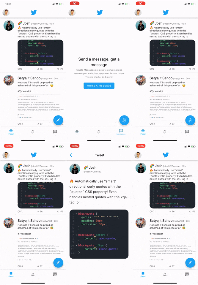
As you can see on the gif, the FAB button works in the same way as in a Twitter app. What's more, it even animates icon change properly even though we haven't implemented it. That's the behavior we get from React Native Paper's FAB out of the box.
Theming
Nowadays, supporting the Light/Dark theme is no longer a fancy way to stand out from other apps, but it has become a standard. Happily, both React Navigation v5 and React Native Paper supports theming and in this section I'll guide you through setting it up.
React Navigation
React Navigation exports two themes:
- DefaultTheme
- DarkTheme
We can import them from @react-navigation/native package and pass to NavigationContainer to apply the theme:
import React from 'react';
import { NavigationContainer, DarkTheme } from '@react-navigation/native';

export default function App() {
  return (
    <NavigationContainer theme={DarkTheme}>{/* content */}</NavigationContainer>
  );
}
React Native Paper
React Native Paper similarly to React Navigation also exports two themes:
- DefaultTheme
- DarkTheme
Once we import a theme we can pass it to the Paper's Provider component:
import * as React from 'react';
import { NavigationContainer, DarkTheme } from '@react-navigation/native';
import {
  DarkTheme as PaperDarkTheme,
  Provider as PaperProvider,
} from 'react-native-paper';

export default function Main() {
  return (
    <PaperProvider theme={PaperDarkTheme}>
      <NavigationContainer theme={DarkTheme}>
        {/* content */}
      </NavigationContainer>
    </PaperProvider>
  );
}
Combining themes
Since both React Navigation and React Native Paper follows the same pattern for theming and structure of the theme object is very similar, we can combine them into one object:
import * as React from 'react';
import {
  NavigationContainer,
  DarkTheme as NavigationDarkTheme,
} from '@react-navigation/native';
import {
  DarkTheme as PaperDarkTheme,
  Provider as PaperProvider,
} from 'react-native-paper';

const CombinedDarkTheme = {
  ...PaperDarkTheme,
  ...NavigationDarkTheme,
  colors: { ...PaperDarkTheme.colors, ...NavigationDarkTheme.colors },
};

export default function Main() {
  return (
    <PaperProvider theme={CombinedDarkTheme}>
      <NavigationContainer theme={CombinedDarkTheme}>
        {/* content */}
      </NavigationContainer>
    </PaperProvider>
  );
}
If code for themes merging looks complex, you can use a deepmerge package. It will simplify the implementation significantly.
Custom themes
Of course, the built-in themes are not the only themes we can apply. Both libraries allow full customization and you can learn about it in the official documentation (React Navigation, React Native Paper)
In the last step, I want to show you how to change the theme dynamically. We will implement a switch in a drawer that will allow users choosing light or dark theme.
We need to store information about the currently selected theme somewhere. The local state of the root component sounds reasonable. Also, we will conditionally pass different themes based on the state.
import * as React from 'react';
import {
  NavigationContainer,
  DefaultTheme as NavigationDefaultTheme,
  DarkTheme as NavigationDarkTheme,
} from '@react-navigation/native';
import {
  DarkTheme as PaperDarkTheme,
  DefaultTheme as PaperDefaultTheme,
  Provider as PaperProvider,
} from 'react-native-paper';

const CombinedDefaultTheme = {
  ...PaperDefaultTheme,
  ...NavigationDefaultTheme,
};
const CombinedDarkTheme = { ...PaperDarkTheme, ...NavigationDarkTheme };

export default function Main() {
  const [isDarkTheme, setIsDarkTheme] = React.useState(false);

  const theme = isDarkTheme ? CombinedDarkTheme : CombinedDefaultTheme; // Use Light/Dark theme based on a state

  function toggleTheme() {
    // We will pass this function to Drawer and invoke it on theme switch press
    setIsDarkTheme(isDark => !isDark);
  }

  return (
    <PaperProvider theme={theme}>
      <NavigationContainer theme={theme}>{/* content */}</NavigationContainer>
    </PaperProvider>
  );
}
As you remember, we already render a Switch in a Drawer, but we haven't implemented any logic when it is pressed. Let's take care of it now:
import React from 'react';
import { View } from 'react-native';
import { DrawerContentScrollView } from '@react-navigation/drawer';
import {
  useTheme,
  Avatar,
  Drawer,
  Text,
  TouchableRipple,
  Switch,
} from 'react-native-paper';

export function DrawerContent(props) {
  const paperTheme = useTheme();

  return (
    <DrawerContentScrollView {...props}>
      /* {...other - content} */
      <Drawer.Section title="Preferences">
        <TouchableRipple onPress={props.toggleTheme}>
          <View style={styles.preference}>
            <Text>Dark Theme</Text>
            <View pointerEvents="none">
              <Switch value={theme.dark} />
            </View>
          </View>
        </TouchableRipple>
      </Drawer.Section>
    </DrawerContentScrollView>
  );
}
Firstly, we get a current theme using useTheme hook from Paper. This means we can check dark property on it and pass the correct value to Switch.
Secondly, we pass a `toggleTheme` function to `TouchableRipple` to toggle theme whenever user presses a Switch.
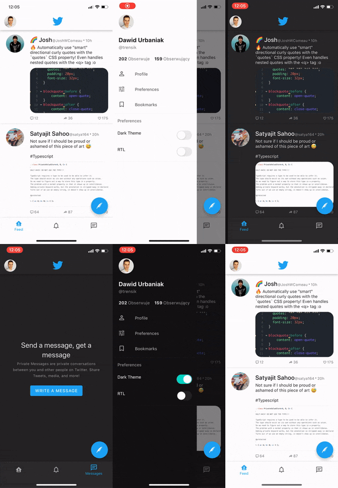
You should be able to toggle a switch now and both Provider from Paper and NativeNavigationContainer from React Navigation will automatically apply correct colors to the components.
Summary
We all know that UI Component library like Paper can speed up the development, but integrating it with a navigation can be sometimes not very straighforward. I hope I showed you the most important aspects of this process in this guide. After reading this article, using Paper's BottomNavigation, Appbar, Drawer, FAB or Portal alongside with React Navigation shouldn't be a problem for you.
Do you have any questions? Tweet to me @trensik.
At the end I want to thank @satya164 and the whole Callstack team for their help with the article.